
Verification and Validation Testing for Medical Devices
Verification and Validation (V&V) are two pillars that ensure a medical device is safe, effective, and compliant before it ever […]

Join us at Qt C++ Warsaw Meetup - 21.08.2025
Sign up for free!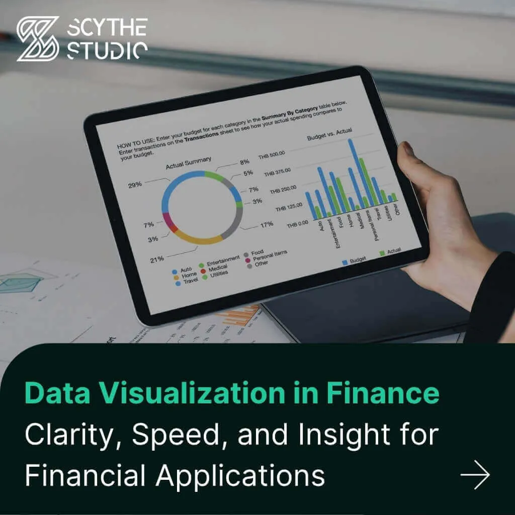
Why is visualization so important in finance? First and foremost is clarity. Good visuals cut through complexity, making it easier for finance professionals and clients to understand financial insights. A well-designed chart or dashboard can explain complex concepts that would take pages of reports to explain. Visualization also speeds up insights.
At Scythe Studio, we are creating high-performance visualization solutions for fintech applications, combining intuitive GUI design in Qt/C++ with robust, high-speed backends developed in C++. In this article we’ll go deeper into the role of visualization in finance—showcasing benefits, use-cases and why investing in powerful visual interfaces today puts you ahead of tomorrow’s financial challenges.
Data visualization isn’t easy. Financial applications have unique challenges in handling real-time streaming, complex data and large volumes of historical data. Markets move fast, so visual interfaces must update continuously and respond with minimal latency. Real-time data visualization means displaying information as it arrives – often in milliseconds – which is critical when decisions are based on changing conditions.
In trading and portfolio management, live charts and tickers need to handle incoming price feeds while keeping visual clarity and responsiveness. That means optimizing everything from data sources to rendering engines. Systems often use in-memory data structures and event-driven updates to achieve the ultra-low latency traders expect. The goal is to turn live market data into visual representations that let users monitor conditions, see patterns and act.
At the same time, financial firms accumulate massive historical datasets – years of price history, thousands of portfolio records and millions of transactions. Visualizing these large static datasets poses its own challenge: how to render dense information without overload. Effective data visualization must balance information density with clarity.
For example, a 20-year price history might contain tens of thousands of data points; plotting them as-is would produce an illegible mess. Successful solutions include intelligent aggregation (summarizing or sampling data points), zoomable timelines and layering detail on demand. Filtering and slicing are essential when dealing with high volume data. A risk dashboard might let the user filter to a date range or portfolio segment so they can focus on a manageable dataset. Without such techniques the sheer volume of financial data would overwhelm any screen.
Another big challenge is accuracy and reliability in the visuals. In finance a small misrepresentation can have big consequences. Visualizations must exactly reflect the underlying raw data – whether that’s a pricing anomaly or a risk exposure – and update in real-time. This often requires robust data engineering and testing behind the scenes.
High stakes decisions (e.g. trading on a chart pattern or reallocating assets based on a risk graph) demand the visualization be trustworthy. Furthermore financial visuals must often comply with regulatory expectations for auditability and transparency, adding another layer of complexity to their design.
Despite these challenges modern technology is rising to the occasion. Techniques like GPU-accelerated plotting and multi-threaded rendering are being used to keep financial dashboards smooth even under heavy data loads. The bottom line is that responsiveness and precision go hand-in-hand – a finance visualization must be fast and clear. By tackling real-time data ingestion, volume handling and accuracy considerations today’s financial applications are delivering responsive charts and dashboards that professionals can rely on even in the most volatile conditions.
Financial data is multi-faceted so a variety of visualization types are used to extract meaningful insights. Here are some of the common patterns that appear in financial applications, along with key use cases:
Time-series charts are the bread and butter of financial data analysis. Whenever you need to show how something changes over time – stock prices, exchange rates, portfolio values, economic indicators – a time-series chart is the go-to. The simplest form is a line chart plotting the value over time, which is highly effective for revealing trends, cycles and anomalies in sequential data. For example an investment app might display a line chart of a stock’s price over the past year, showing revenue growth and seasonal fluctuations.
Line charts should be kept simple and focused. It’s best practice to avoid clutter by limiting the number of series or data points, and to use clear labeling and scaling for readability. In finance, less is often more – a clean line chart with key dates or events annotated can convey more insight than a complicated graphic.
While individual charts are useful, much of finance benefits from dashboards – integrated views that bring multiple visuals and financial metrics together. A portfolio monitoring dashboard for instance might combine a few charts and data points to give a holistic view of an investment portfolio’s status. Such a dashboard could include a time-series area chart of total portfolio value, a bar chart breaking down holdings by asset class or sector, and key risk metrics like today’s profit & loss, exposure by region, or VaR (Value at Risk) figures.
The goal is to create a visual command center for financial operations. By consolidating key performance indicators (KPIs) from diverse sources into one interface, dashboards help users see the “big picture” and drill down into details as needed. A well-designed financial dashboard should be flexible. Users might toggle the view to different time periods (e.g. YTD vs. 5-year financial performance) or filter the data by portfolio, account or strategy.
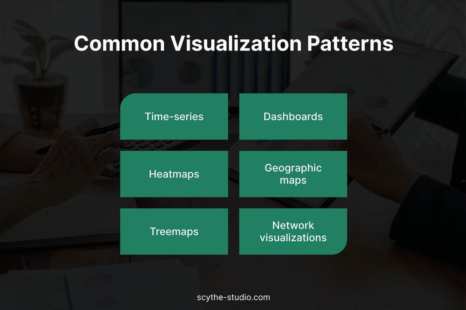
When it comes to understanding risk and relationships in complex financial data, heat maps are a powerful tool. A heatmap uses color shading to represent values in a matrix, making it perfect for highlighting concentrations, correlations or intensities across two dimensions.
In finance one popular use is the risk correlation matrix. Heatmaps excel at revealing such patterns and clusters in large datasets. They can simplify complex correlation tables into an immediately understandable visual that flags where potential risks might be too concentrated.
Financial institutions also visualize financial data metrics like Value at Risk (VaR) distributions to understand potential losses. VaR results can be shown as a curve or histogram (to illustrate the distribution of possible losses), or even overlaid on a heatmap or contour chart to highlight tail-risk regions.
Modern risk visualization tools translate complex statistical outputs – whether VaR, stress test results or scenario analyses – into intuitive visuals like heatmaps, bubble charts or network graphs that pinpoint things like concentration risk and counterparty exposure networks.
Finance isn’t limited to charts and heatmaps – depending on the application you’ll find many other visualization types. Geographic maps are useful when location matters, such as showing real estate investments or loan portfolios across regions, shaded by performance or risk. Tree maps and sunburst charts present hierarchical data like budget breakdowns or portfolio allocations in a compact, visual form. Stacked bar charts can show relationships – for example, plotting credit scores versus loan default rates to reveal patterns. In recent years some advanced trading and analytics platforms have even explored 3D or augmented reality visualizations to help users navigate complex, multidimensional datasets.
One of the biggest advancements in modern financial visualization is interactivity. Unlike the static charts of the past, today’s financial apps let users actively engage with the data visuals. This interactivity is not just a nice-to-have – it’s essential to get to deeper insights. By interacting with a chart or dashboard, users can see why something is happening, not just what is happening.
For example in an interactive profit-and-loss chart a user might click on a particular day’s dip to see which trades or assets contributed to the loss. Or on a trading dashboard zoom into a 5-minute interval around a price spike to see the order flow or related news at that moment. These interactions turn visualizations into a two-way communication tool.
Common interactive features include zooming and panning in time-series charts, filtering by category (e.g. viewing one sector or account at a time), and toggling chart series or indicators. Many financial tools also let users rearrange components, adjust parameters or drill down from a summary to a detailed view – which is crucial in finance where the first glance often raises follow-up questions.
Interactivity also helps with pattern discovery. By rapidly slicing and dicing data users can uncover anomalies or correlations that static reports might otherwise hide.
Financial institutions are using advanced data visualization tools and machine learning (ML) models to get an edge – whether it’s a model predicting market trends, an algorithm assessing credit risk or an AI flagging fraudulent transactions. Integrating these analytics outputs into visualizations is key to making them actionable.
Data visualization tools are the bridge between complex quantitative models and human intuition. By overlaying model results on intuitive charts or visualizing algorithmic outputs in dashboards users can understand – and make sense of – the findings.
Examples:
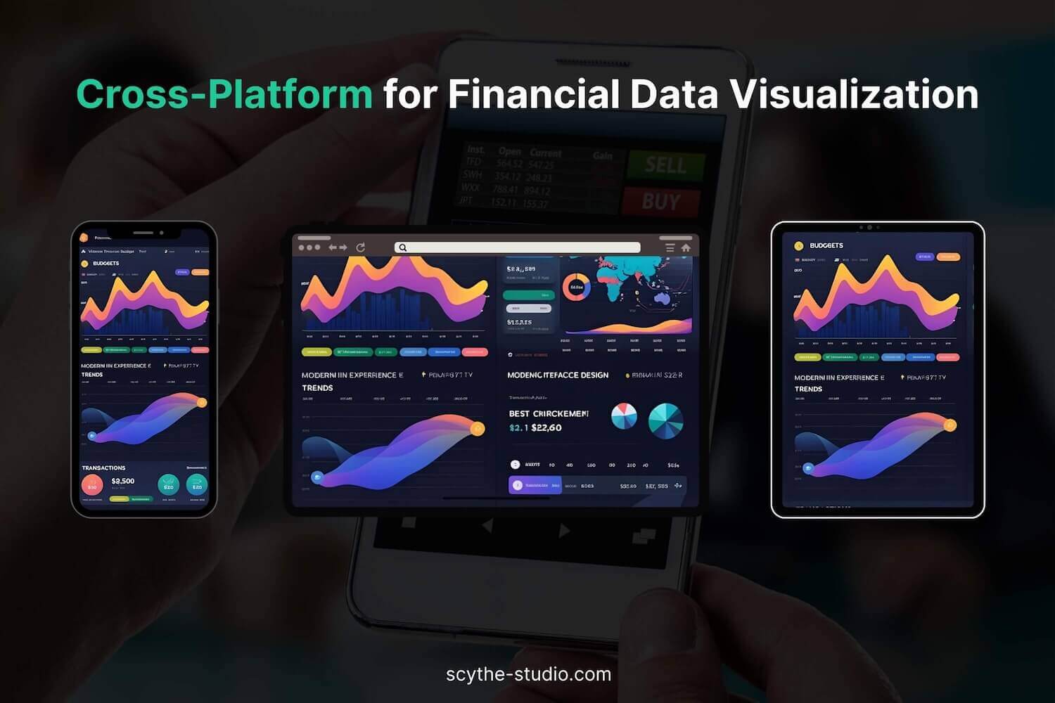
Finance professionals expect to be able to use their tools wherever they are – on a multi-monitor desktop setup at the office, on a laptop at home or on a mobile device while traveling. This means cross-platform consistency is important for financial application developers.
The challenge is to deliver rich, responsive data visualizations that feel the same and work the same across Windows, macOS, Linux, web browsers and mobile devices. Many finance teams address this by using robust cross-platform frameworks for their user interface. For example, Qt development is a popular choice in the industry for building high-performance trading GUIs. Qt provides a rich set of UI components and is optimized for speed, allowing developers to build responsive and intuitive interfaces with advanced 2D/3D visualization and real-time data updates.
Crucially it’s a cross-platform framework – a single codebase can be deployed on desktop OSes and even mobile without sacrificing performance or rewriting logic for each platform. This means a trading application or portfolio tool built with Qt/C++ can have the same snappy charts and graphs on a trader’s Windows desktop and an analyst’s Mac with a consistent user experience.
Performance is key in financial data analysis. We’ve touched on the need for real-time responsiveness and handling large datasets; achieving that often requires low-level efficiency. That’s why performance-intensive parts of financial visualization apps – data handling, numerical computations, custom rendering – are often implemented in C++ or other high-performance languages.
C++ provides the speed and memory control needed for processing streaming market data or for performing rapid calculations (like updating thousands of points in a chart every second). When combined with a Qt framework or libraries optimized for graphical rendering it enables smooth visual updates even under heavy load.
In finance, data visualization is more than an add-on – it’s a fundamental part of how professionals consume information and make data-driven decisions. From real-time stock analysis to portfolio dashboards and risk maps, visualization helps cut through complexity and noise. Clean, interactive visuals get you to insights and decisions faster by presenting the right data in the right way at the right time.
Moreover, the interactive and analytical capabilities in modern financial visuals let you ask deeper questions and explore “what-if” scenarios on the fly.
For companies building financial applications, investing in data visualization skills is investing in user effectiveness and happiness. When done well, a chart or dashboard isn’t just pretty – it’s a problem-solving tool that can reveal opportunities, flag risks and drive business value.
Data storytelling helps identify trends and highlight patterns in financial health, enabling better risk management and understanding of emerging trends. By breaking down data silos and providing comprehensive financial analysis through intuitive interfaces – like Excel spreadsheet alternatives – modern visualization tools empower organizations to make more informed decisions.
Building financial interfaces takes more than visuals – it takes performance and design mastery. Learn more about our approaches in C++ development for finance.


Let's face it? It is a challenge to get top Qt QML developers on board. Help yourself and start the collaboration with Scythe Studio - real experts in Qt C++ framework.
Discover our capabilitiesVerification and Validation (V&V) are two pillars that ensure a medical device is safe, effective, and compliant before it ever […]

From medical devices and smart vehicles to industrial controllers and consumer electronics, embedded systems are everywhere—and increasingly connected. But with […]


Hey, welcome back to another blog post. Today we’re going to talk about the new Qt WebAssembly. This post will […]
